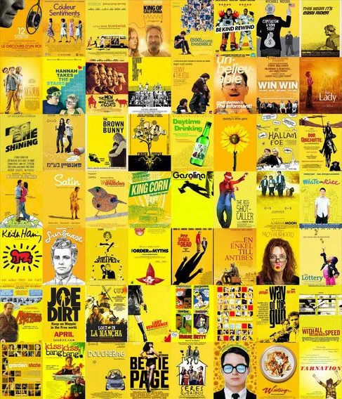
Yellow is the New Black
When you walk into a movie theater, you're likely to see posters for all sorts of films. But if you look closer, you'll start to notice how different genres and types of films will use colors differently on their posters. For example, horror films tend to use dark colors like black or red, while action movies often use bright colors like orange or blue. But what about indie films? What colors do they typically use? The answer may surprise you: yellow!

Warm + Cool = Tornado
If you’ve ever seen a movie poster for an action movie, then you’ve probably noticed how they all share a commonality. They often use the contrast between warm and cool tones to create a visually appealing image that is designed to get people interested in watching the film. However, this technique is so overused that it has become quite predictable. Let’s take a closer look at why this technique is used so often in action movie posters, and why it might be time for directors and producers to start thinking outside of the box when it comes to creating eye-catching posters.